Orbit/Extra
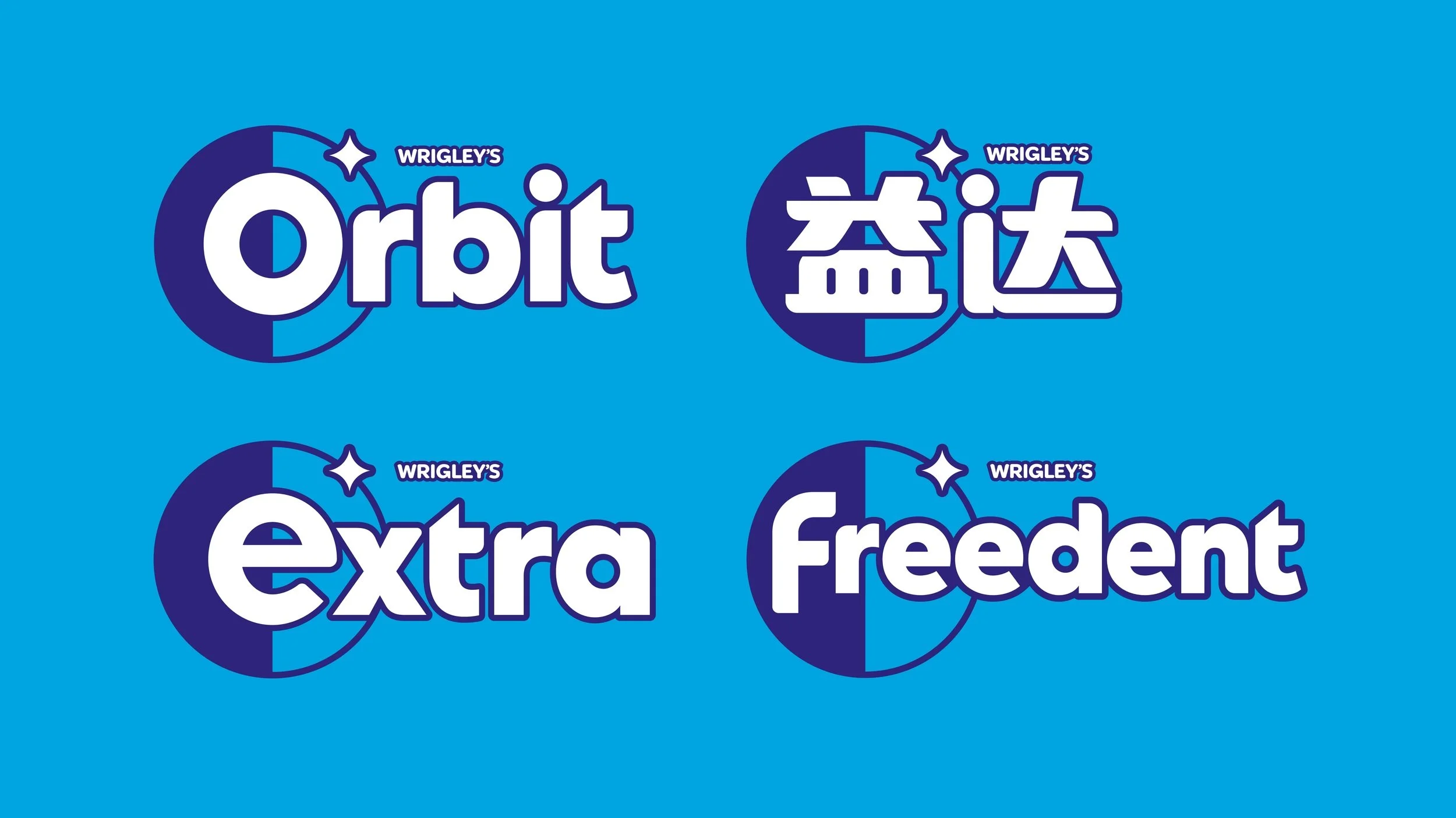
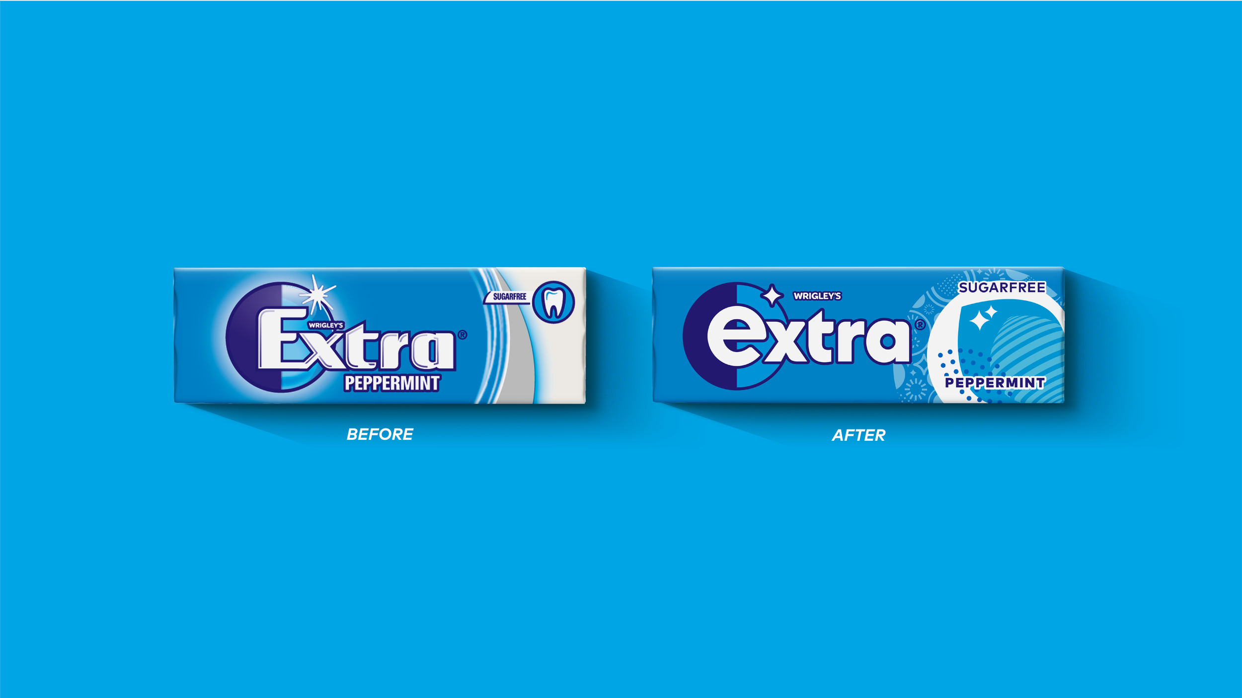
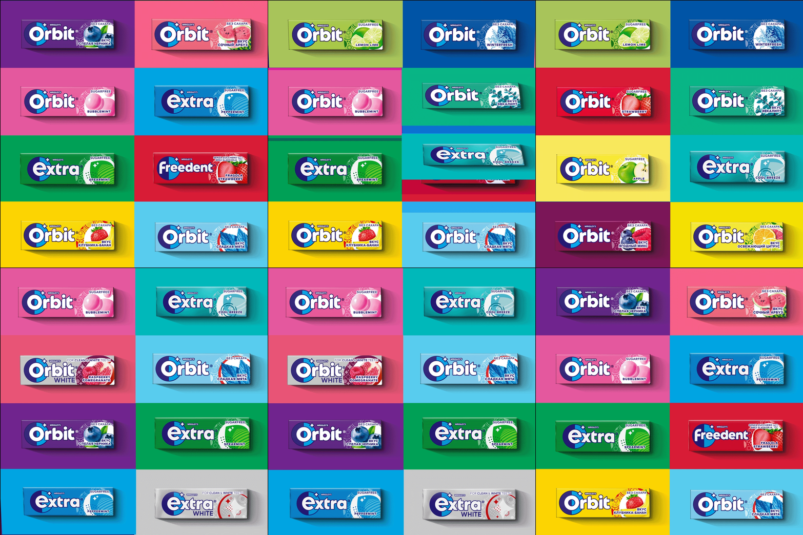
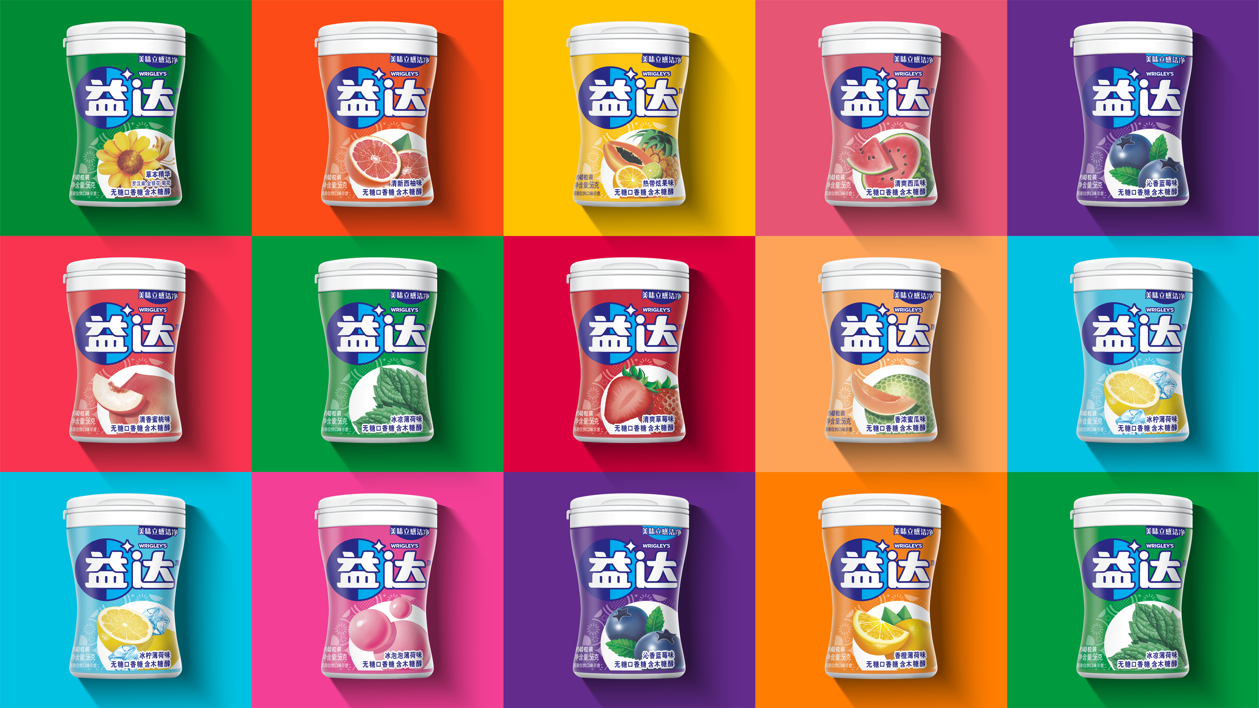
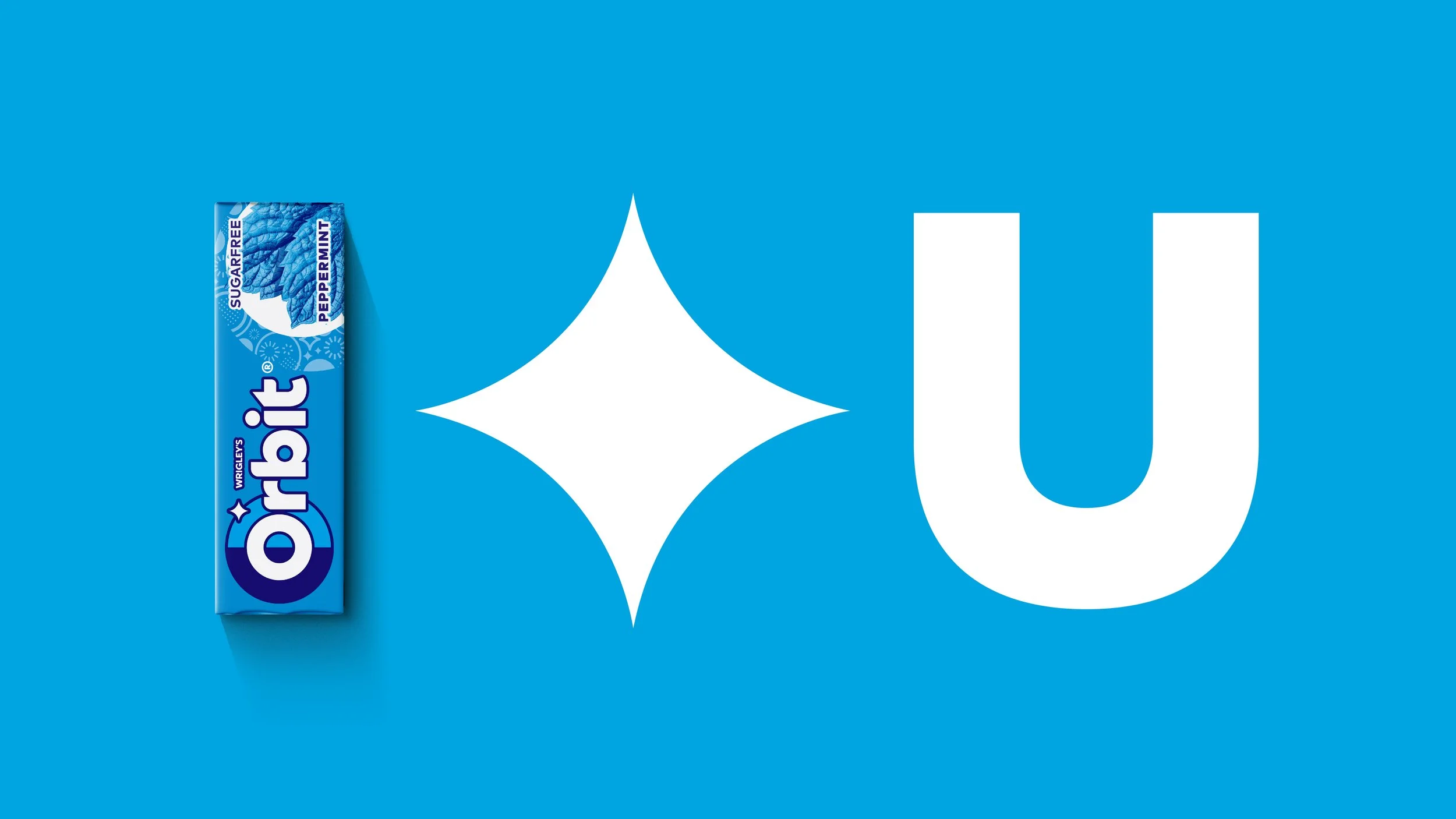
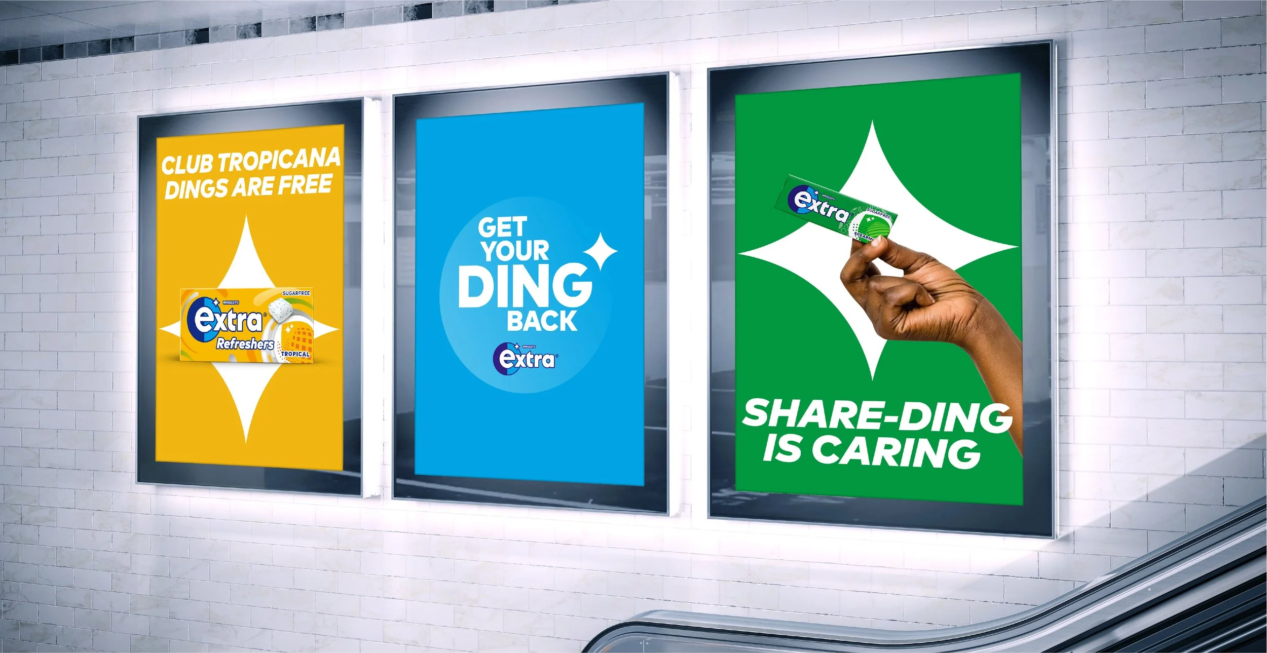
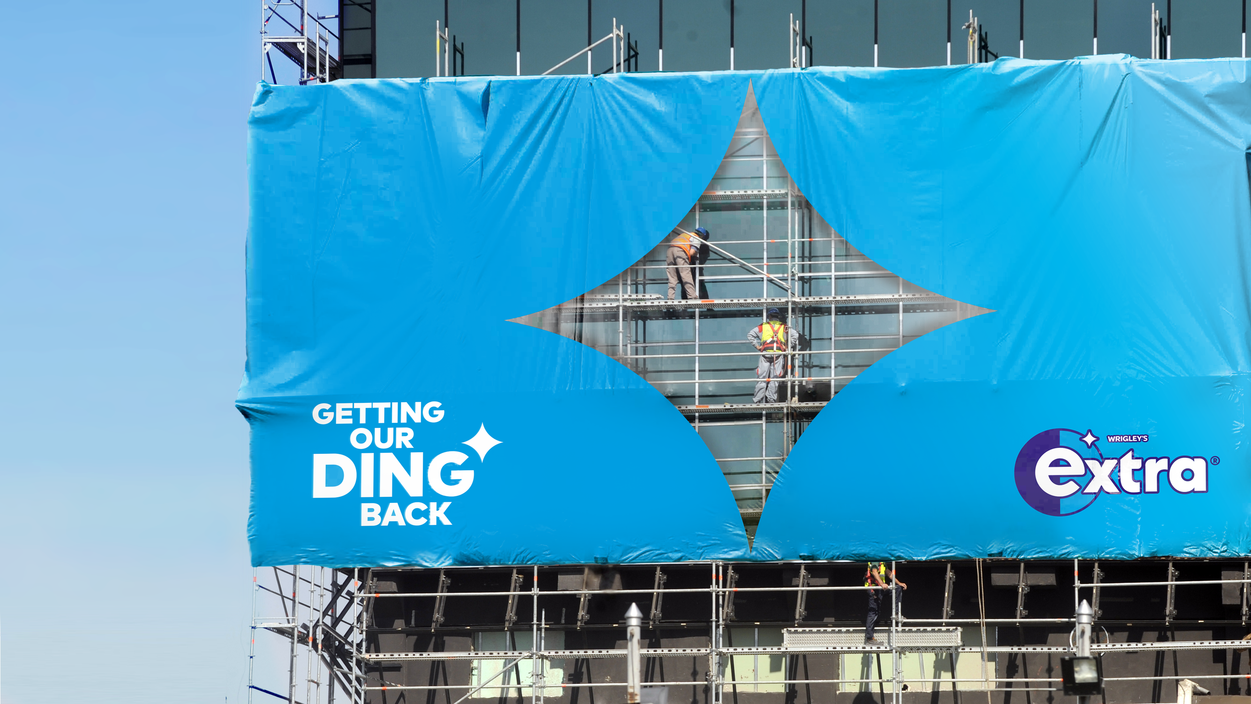
Also known as Yida and Freedent globally. A new brand identity leverages existing assets and introduces new ones to appeal to a younger audience in a more relevant way. The ‘Ding’ shape within each brandflag now also stands alone as an asset. It communicates refreshment in product storytelling, and acts as a metaphor for moments of confidence in activations and campaign.
SILVER WIN Best Visual Identity from the FMCG Sector - Transform Awards 2022
SILVER WIN Best Identity/Brand Design - World Brand Design Society Awards 2022
Silver - Graphis Packaging awards 2022
Pentawards Shortlisted 2022
